Five Things to Know About Community-Based, Interactive Data Visualization

By Lina Maria Giraldo, Assistant Professor of Journalism
As told to Isa Luzarraga ’25
Growing up in Colombia at a time when violence plagued the country, Lina Maria Giraldo found both healing and expression in creating art. For her, art became “a way to tell stories, understand and find my way in the world. It made me who I am.”

Giraldo took that passion to the Massachusetts College of Art and Design, where she did undergraduate work, and later to New York University’s Interactive Telecommunications program. There, she discovered the field of data visualization and new ways to combine art with technology as a means to inform and help communities while also involving its members.
She applied this knowledge by serving underrepresented communities – especially Latino and Haitian — as an artist-in-residence with the City of Boston. She also was part of the team that designed an award-winning educational website for the John F. Kennedy Presidential Library. In 2019, she brought her expertise to Emerson College as an affiliate instructor, and this year was appointed to a full-time position in the Department of Journalism.
Besides teaching data journalism courses, Giraldo is involved in multiple community projects and art installations. She is currently working on an air sensor installation project with the non-profit Boston Cyberarts and hopes to engage cohorts within communities like Chelsea, Lawrence, and South Boston, among others.
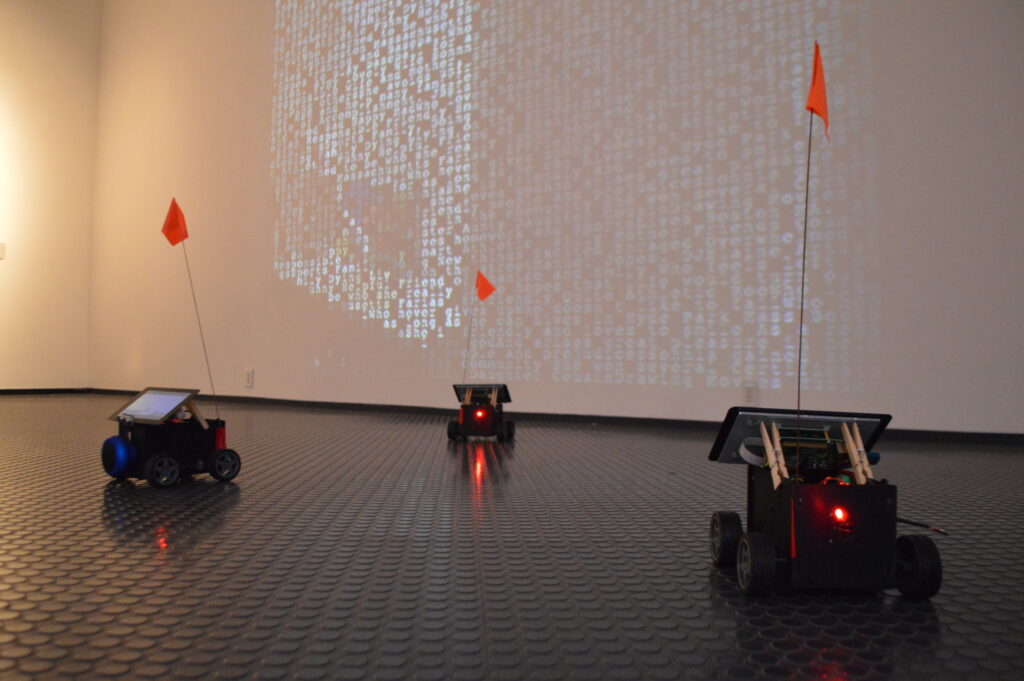
Photo contributed by Lina Giraldo
With help from Journalism graduate and undergraduate students, Giraldo and her team will partner with local organizations to build air sensors, collect air quality data, and eventually display their findings as art. They are hopeful their investigation will motivate city-wide advances in indoor air quality.
Whether her projects relate to journalism, the arts, or community activism, Giraldo embraces the contextualization of information. “We need to have a qualitative context [with data visualization],” Giraldo says. “We need to understand the political tones. I try to think of data from the quality of perspective. Numbers don’t speak for themselves.”
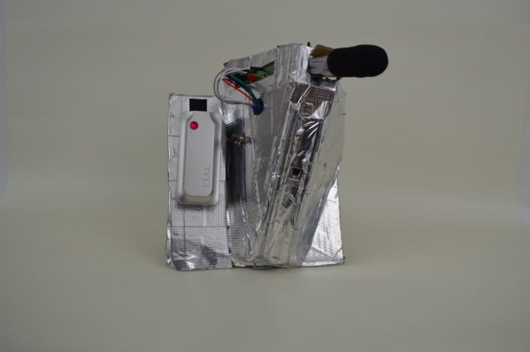
Photo contributed by Lina Giraldo
The intricacies of data visualization and community-based storytelling encompass more than just five themes. Still, Giraldo broke down five main ideas that define her design process.
- Objectivity is subjective.
Journalists are too familiar with the “objectivity debate.” While an ideal helpful for motivating fair reporting, even the best journalists are unable to completely shed their biases.
Giraldo recognizes this and strives to always examine any potential subjectivities she carries before beginning a new project. Because of her Latina identity and familiarity with the misrepresentation of the Hispanic/Latinx community, she takes time to examine her intentions when sharing stories regarding these demographics.
“We need to be more attuned to [how] a community is being framed and who is in the stories,” she said. “It is extremely important that the community is the one who’s telling the stories and we, as the storytellers, are just a facilitator or a tool.”
- Design does not define the process, it happens with the process.
Developing a design for a specific project is not always a linear process. Giraldo said she has learned to embrace the “messiness” of designing. This constant evolution of design reflects our ever-changing surroundings. She encourages her students to be open to adjusting their data visualization process.
“[While] learning from the community and from the people you’re designing for, you start with an idea, a hypothesis that’s created with that community or stakeholders. There are many things and there are many probabilities that happen while you are in the [design] process.”
- Failing is the most important part of design practice.
Giraldo first heard this from her professors at NYU when she was working towards her master’s degree. She says coming from a more traditional background, where her best was always expected, made it more difficult to embrace the concept of failure. However, after much practice, Giraldo now advises her students to adopt this same adage.
“It took a change of mindset to really understand that [failure is valuable] and really kind of project that in the design process,” Giraldo said. “The only way we can actually understand the process step by step, from ideation to creation, is really encouraging [ourselves to] fail. We need to start with a hypothesis and we need to enjoy that messiness that is happening in the process.”
- Data is grounded in human perspective.
Communities and demographics are inextricably connected. Data journalism prompts Giraldo to consider the humans behind the numbers. She said she wants to “humanize” the data and remind others that data visualization and all community-based storytelling have implications.
“When we’re looking at data, we need to be very cautious and very critical of how the data is being collected,” Giraldo said. “Who is collecting the data? Who is producing the data? Where are we within this data?”
- Sometimes you don’t have the right tools to tell a story.
Data interpretation and visualization impact lives. When explaining this maxim to others, Giraldo uses the example of the U.S. Census. Prior to 1976, Latinx people weren’t counted as a demographic group within the U.S., and as a result, their interests were misrepresented, as well as their actual voting power.
It is because of this impact Giraldo integrates elements of social advocacy into her data visualization. Part of this process includes identifying when there are not enough strategies or processes to effectively portray an issue or demographic.
“One of the issues we have with technology is people bas[ing] their stories on the technology that is presented,” Giraldo said. “There is a lack of inclusion in that process. So, one of the biggest issues we have in the design process, the news, or when we are thinking about users’ experience, is that we don’t have the right tools to tell that story. It is important that we define the story as the storytellers and inform the technology in the process .”
Categories
Isabella Luzarraga View All
Isa is a senior journalism major minoring in media studies. She is from Omaha, Nebraska but loves coming back to the city. Outside of coursework, Isa is the Managing Editor of Your Magazine, the secretary of Emerson's chapter of NAHJ and a freelance writer for publications nationwide. She loves reading in the Common, going for long runs and sipping iced coffee.